From Static Web Design to Responsive Web Design

Summary: Responsive Web Design (RWD in short) is gaining traction over the past several years. With industry heavy weights like Microsoft adopting responsive web design for their major corporate/product websites, more and more website owners are jumping on the bandwagon. As a web designer and/or developer, gaining responsive web design skills under your belt will position you well for the golden age of responsive web design to come.
Article Highlights
What is Responsive Web Design After All?
In Wikipedia, Responsive Web Design is defined as:
Responsive web design (RWD) is a web design approach aimed at crafting sites to provide an optimal viewing experience—easy reading and navigation with a minimum of resizing, panning, and scrolling—across a wide range of devices (from mobile phones to desktop computer monitors).
RWD is essentially a single-website-content-fit-all-devices solution. You code the content with standard html codes (i.e. separation of contents from presentation). Then you add CSS that targets different device widths with breakpoints.
In a era when mobile viewing is fast bypassing desktop viewing, Responsive Web Design will soon become a matter of life and death for websites to succeed in the coming years.

Techniques You Need to Know
- Design – Responsive UI Design
- Coding – Understanding Break-point Concepts, Grid-based Framework
- Coding – Responsive Menu, Responsive Images, Progressive Enhancements
- Testing – Testing for Different Device Widths
Responsive UI Design
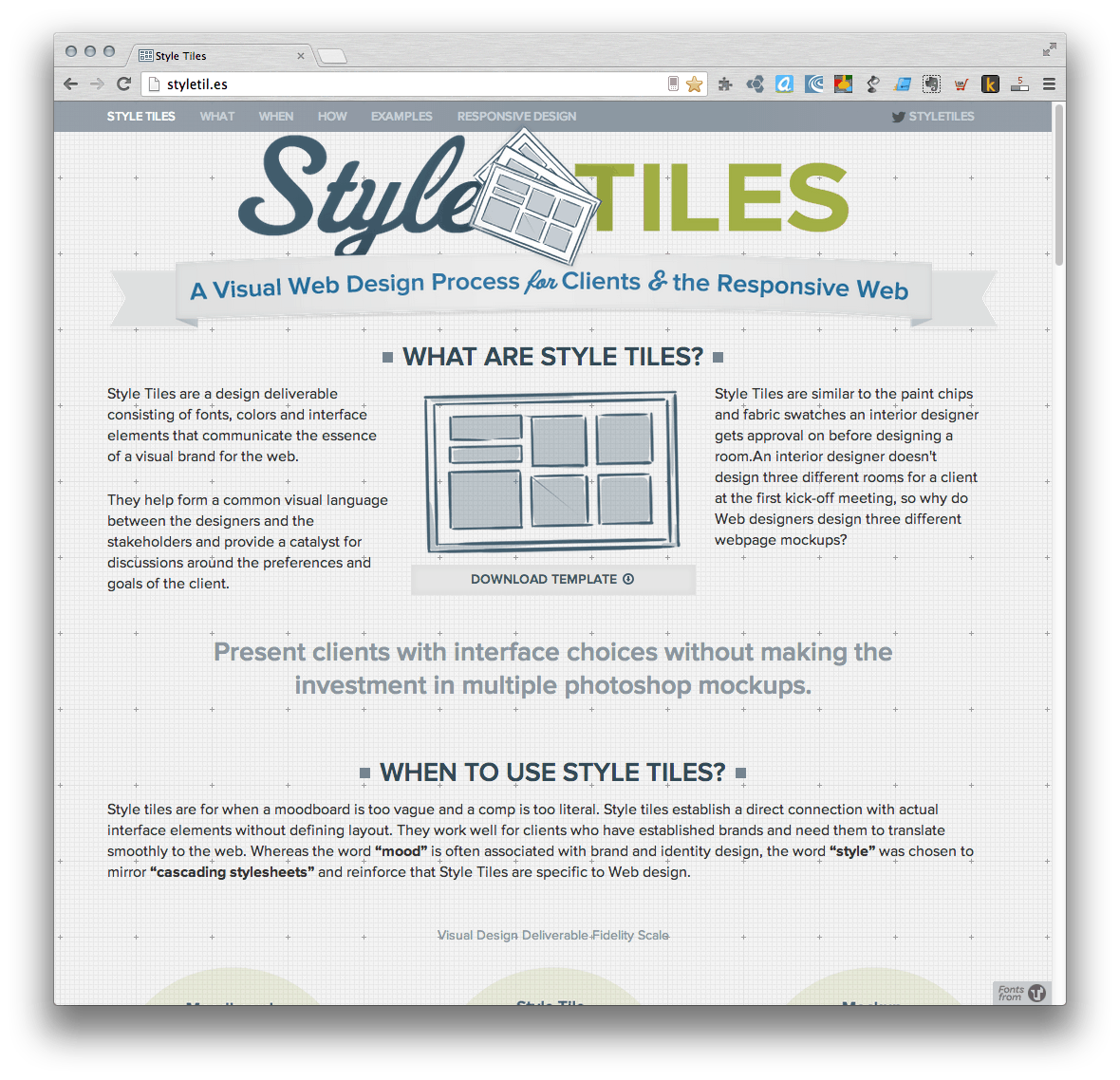
As traditional way of doing web design using still photoshop images is not well posed to responsive web design, Samantha Warren has put forth the Style Tiles technique. It is bascially similar to the branding design guideline in the graphic design world. The overall feelling, color scheme, typography and basic branding elements are designed/described without reference to the pixel width of the page. With the style tiles approved by the website client/owner, more detailed mockup could be created for different device widths.
Understand Break-points
In the early days of development, responsive web design often specifies break-points tailored for iPhones (and also iPods) and other android devices. However, with the proliferation of different types of screen sizes (even iPhone 5+ comes with a longer screen), a new paradigm of ‘Design Based Media Queries’ is fast becoming the norm. In the essence, Design Based Media Queries is based on the actual design needs of the website (e.g. the minimum width to display the page with the full design) instead of targeting certain device widths. More information can be found here.
Grid-based Frameworks
Foundation and Twitter Bootstrap are two most popular frameworks for responsive web design. There are a lot of debates going on which is better. Just like any other products, with time they are gonna to catch up with one another by incorporating the best practices. I would bet there are no show-stopper differences in the long run. Choose any one for making the prototypes. But in order to present a more polished experience for more sophisticated websites, it is better to give up the frameworks for production and code from scratch using ‘Design Based Media Queries’ and other tools, e.g. this responsive framework is much more lightweight (only 20.4kb minified) which is more suited for production.
Alternatively, there is also a very light weight set of CSS modules named Pure that you can choose which from:
| Name | URL |
|---|---|
| Base | http://yui.yahooapis.com/pure/0.3.0/base-min.css |
| Buttons | http://yui.yahooapis.com/pure/0.3.0/buttons-min.css |
| Forms (Responsive) | http://yui.yahooapis.com/pure/0.3.0/forms-min.css |
| Forms (Non-Responsive) | http://yui.yahooapis.com/pure/0.3.0/forms-nr-min.css |
| Grids (Responsive) | http://yui.yahooapis.com/pure/0.3.0/grids-min.css |
| Grids (Non-Responsive) | http://yui.yahooapis.com/pure/0.3.0/grids-nr-min.css |
| Menus (Responsive) | http://yui.yahooapis.com/pure/0.3.0/menus-min.css |
| Menus (Non-Responsive) | http://yui.yahooapis.com/pure/0.3.0/menus-nr-min.css |
| Tables | http://yui.yahooapis.com/pure/0.3.0/tables-min.css |
For simplicity, the grids can be considered just like tables with codes like <div class=’row’> and <div class=’four columns’>…</div><div class=’eight columns’>…</div>. For desktop browser, a maximum of twelve columns can be displayed side by side. When the viewport is narrow, the two columns may stack against each other.

Responsive Menu
There are several patterns emerged for the responsive menu. The simplest form is hiding the menu and placing the ‘hamburger’ icon there as a control. For a more native look and feel, the slide-in menu has fast becoming the winner. The jquery plugin called pageslide will help you to implement this pattern with ease.

If your menu is very complicated and contains several levels, the Responsive Multi-Level Menu may help you.

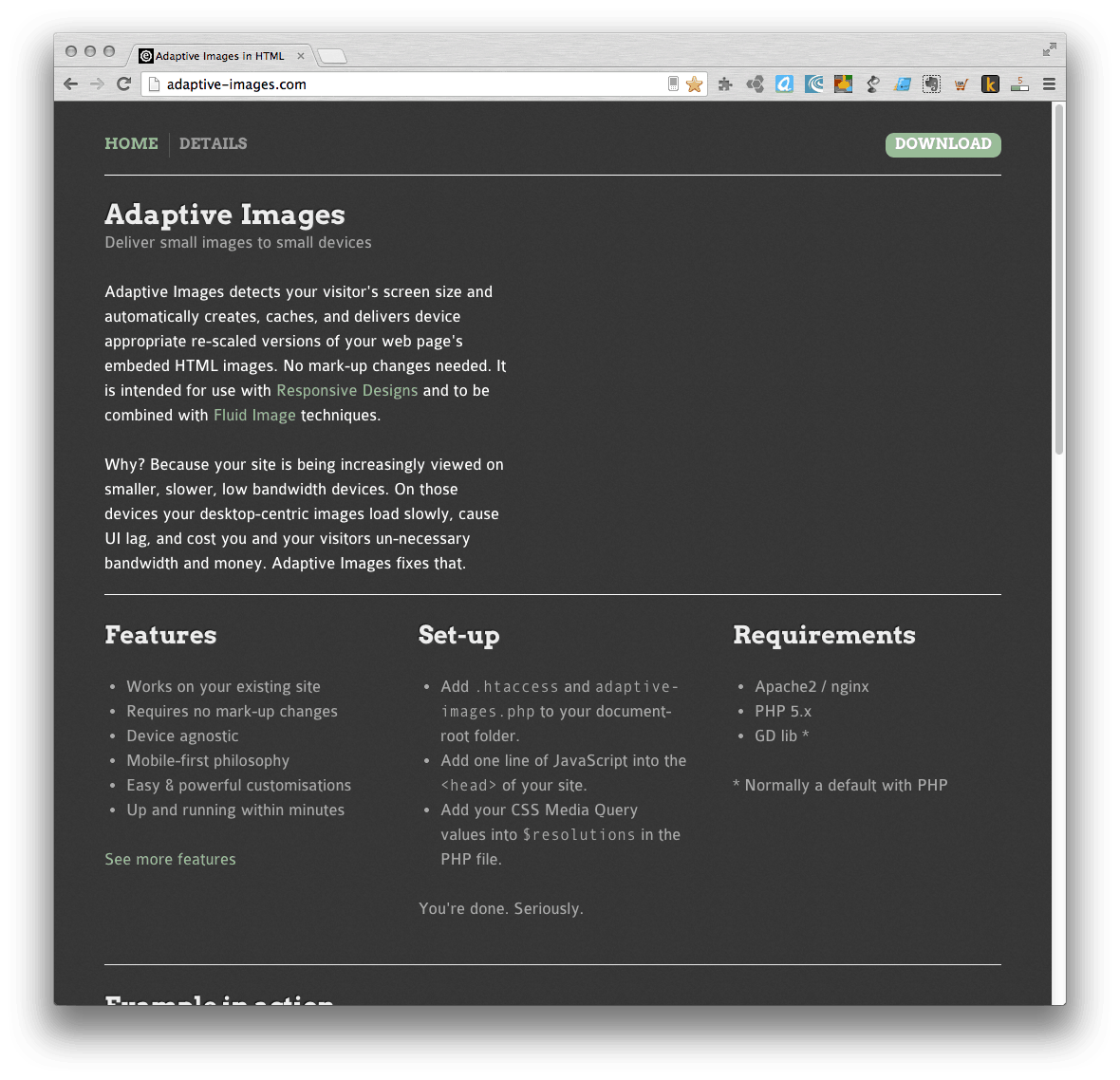
Responsive Images
Bandwidth usage for images is a serious concern over early implementation of responsive web design. Luckily free tools are emerging tackling responsive images. One of the best implementation is Adaptive Images. Adaptive images introduces a non-intrusive automatic method for responsive images . You only need to upload/amend a .htaccess file, upload a php file and insert a line of javascript into the html of each page. Then Adaptive Images scripts will do the hard work of generating images with different dimensions and serving the right images to the right devices. It is also compatible with retina display. However, if your images are dynamically generated from scripts, you will need to incorporate the adaptive image process in your script manually. Also, if your images are located more than 2 levels from web root, chances are that your images will not show up at all with the default setting. In that case, you need to change the .htaccess script.
Another way is to generate the images with different resolutions manually (or using Photoshop actions) and select the suitable image resolution based on the screen width using javascript solutions like the HiSrc. You will need to first set the image sources to the lowest resolution images (i.e. mobile first approach) and let javascript to determine which higher resolution images are optimal.
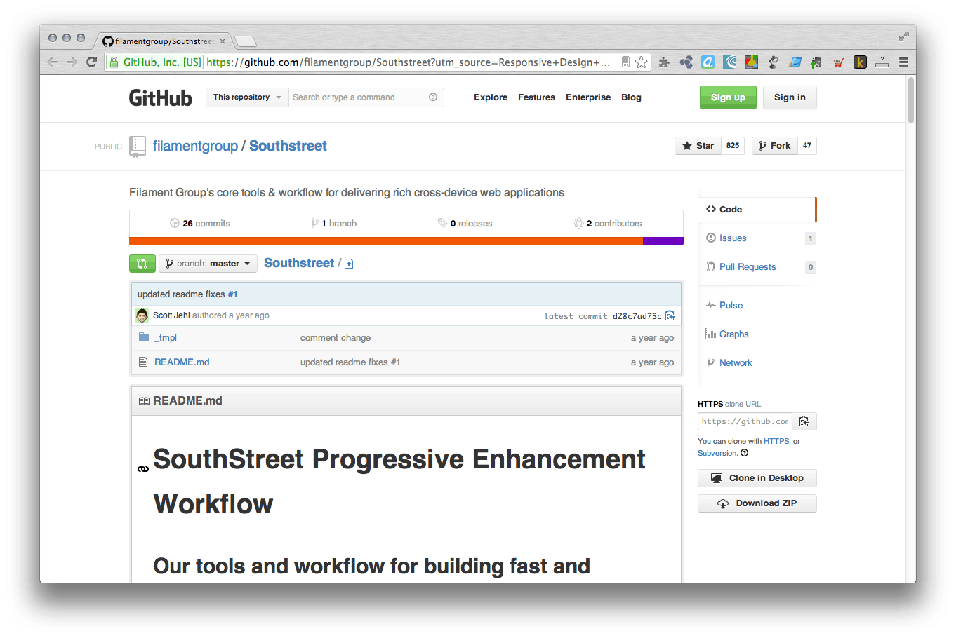
Progressive Enhancement
The SouthStreet contains a set of tools to be used in RWD as progressive enhancement scripts, functionality includes: responsive and dynamic loading of scripts, responsive markup, etc. Many are indispensable tools for RWD.
Testing for Different Device Widths
In the early phase of development, you may manually drag and resize the window width to test the results on a desktop browser. For more efficiency, Matt Kersley has created a simple application to view the different widths on a single web page. You may also use applications like Dreamweaver with built-in preview.
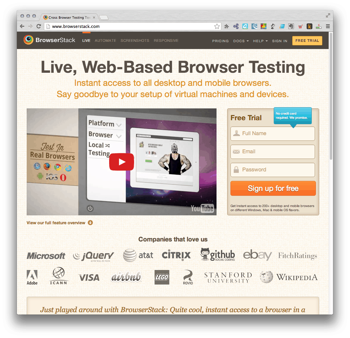
For more rigorous testing, ideally you should gain access to as much devices as possible in order to view the actually rendering of the pages. You may use applications like Browserstack to access many different live desktop and mobile browsers from the comfort of your desktop. The downside is this is a paid service.
Additional Enhancements
- Enhance the perceived performance on mobile using techniques like adding touch state to to buttons, momentum scrolling, etc. that would make the website perceived to be more reactive. You may refer to this article for more details.
Things Not So Well
- Sometimes when some images/elements are not suitable for displaying on small screen sizes, display:none is normally used to hide the images/elements. However, the images/elements are still downloaded which eats up a lot of bandwidths. The mobile-first approach is trying to solve this problem. Large images should be included in resolution specific CSS rather than the general CSS. Server-side browser sniffing can also be a solution but is till not perfect given the release of new devices/OSes/Apps every month.
- CSS Media Queries is not supported on IE8, one of the top web browser in Hong Kong.


 Hi, my name is Edward Chung, PMP, PMI-ACP®, ITIL® Foundation. Like most of us, I am a working professional pursuing career advancements through Certifications. As I am having a full-time job and a family with 3 kids, I need to pursue professional certifications in the most effective way (i.e. with the least amount of time). I share my exam tips here in the hope of helping fellow Certification aspirants!