Quality Control: Run Chart vs Control Chart for PMP Exam

The PMBOK® Guide mentions the Seven Basic Tools of Quality for the Project Quality Management Area, these seven tools are:
- Cause-and-effect diagram (i.e. “fishbone” / Ishikawa diagram)
- Check sheet
- Control chart
- Histogram
- Pareto chart
- Scatter diagram
- Flowchart
Of these Seven Basic Tools of Quality, the Run Chart and the Control Chart are often confused by many Aspirants as these two look very alike. This post will answer the question: what are the similarities and differences between Run Chart and Control Chart. (Please note that this post is not a detailed discussion of run chart and control chart, it includes all that Aspirants need to know for theexam only.)
Article Highlights
Run Chart vs Control Chart for PMP Exam
- Run Chart: A Run Chart simply plots the data of a variable over time.
- Through analysis of a run chart, the following can be derived:
- changes / trends of the process over time
- any pattern / cycle of the process
- Examples of a run chart:
- progress of the project / processes / tasks (percentage completion over time)
- expenditure of the project
- Plus: A run chart is easy to draw and interpret. It is useful for analysis of simple processes.
- Minus: Cannot show if the process is in control or stable. Not quite useful for quality control.
- Through analysis of a run chart, the following can be derived:
- Control Chart: A Control Chart also plots the data of a variable over time (same as the run chart), but also includes specification limits (Upper Specification Limit USL and Lower Specification Limit LSL) and control limits (Upper Control Limit UCL and Lower Control Limit LCL).
- Specification Limits: provided in the project plan / contract as a project requirement of the process;
- Control Limits: specified by the quality requirements of the process (e.g. 3-sigma); if a data go beyond the control limits or a pattern/trend has been formed, corrective actions must be taken to correction the deviation.
- Tells whether the process is under control
- Telltales of “Out of Control”:
- Any data point outside the control limits
- Rule of 7: 7 consecutive data points within the control limits but on either side of the mean
- A trend has been formed (e.g. 6 consecutive points forming an increasing or decreasing trend)
- Telltales of “Out of Control”:
To put it another way, a Control Chart is a Run Chart with 4 line indicating the limits added (upper/lower specification limits and upper/lower control limits) (plus optional a line indicating the mean of all data).
Run Chart vs Control Chart Illustrated
Below is a simple chart illustrating the difference and similarities between Run Chart and Control Chart:
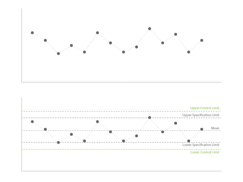
Which one is run chart and which one is control chart?
Mock Exam Question
- Paul, the project manager, is currently assessing the quality of a process of the deliverable. Which of the following charts/diagrams should he make use of when he wants to know whether the process is under control?
- Control Chart
- Ishikawa diagram
- Run Chart
- Pareto chart
Solution: A
The Control Chart is a run chart including the upper/lower specification limits and upper/lower control limits which are thresholds indicating whether the process is under control / meets the quality specified by the project.
Conclusion: Run Chart vs Control Chart
To put it simply:
- Run Chart: plotting the value of a variable over time to analyze the trend of a process
- Control Chart: basically a Run Chart by adding a mean, two specification limits (Upper Specification Limit USL and Lower Specification Limit LSL) and two control limits (Upper Control Limit UCL and Lower Control Limit LCL) to analyze whether the process is under control
Hope this article can illustrate the differences between Run Chart vs Control Chart well.
 Additional FREE PMP resources: 47+ Commonly Confused Term Pairs with detailed explanations. If you found this article useful, you may wish to reference other Commonly Confused Term articles.
Most Popular PMP Certification Exam Articles
- My Exam Prep Tips and Free Resources (I got 4P and 1 MP)
- How to Get 35 Contact Hours Fast and Easy?
- Detailed Comparision of online PMP Courses
- Over 1000+ FREE Quality Mock Exam / Practice Questions
- A FREE Guide to Formulas and Calculation (with explanation and sample questions)
- 47 Commonly Confused Terms with detailed explanation



 Hi, my name is Edward Chung, PMP, PMI-ACP®, ITIL® Foundation. Like most of us, I am a working professional pursuing career advancements through Certifications. As I am having a full-time job and a family with 3 kids, I need to pursue professional certifications in the most effective way (i.e. with the least amount of time). I share my exam tips here in the hope of helping fellow Certification aspirants!





In regards to Joaquim comment on January 21, 2018 at 19:25….
PMPBOK 6th edition: pp 741, CONTROL LIMITS: The area compoused of three standard deviations on either side of the centreline or mean of a normal distribution of data plotted on a control chart, which reflects the expected variation in the data.
PMPBOK 6th edition: pp 762, SPECIFIACTIONS LIMITS: The area, on either side of the centreline, or mean, of data plotted on a control chart that meets the customers requirements for a product or service. this area may be grater than or less than the area difined by the control limits. I was wrong, you were right, Thnak you. Will be taking my PMP exam this comming November !!! Best reagards,
Thanks for your reply. Wish you PMP success!
I failed my first attempt on 3/19….Now I need to retake but after March 26 its 6th addition…. any tips>?
Sorry to hear that. But don’t worry too much. The PMBOK Guide 6th edition is evolved based on the 5th edition. With a firm foundation in the current PMP Exam, you will be able to pass the new PMP Exam with more confidence. Please read this article as a start:
https://edward-designer.com/web/begin-preparing-new-pmp-exam-beyond-march-2018-now/
Wish you PMP success!
Hello, thank you for the great information that you put here.
Regarding the control chart, I think the control limit and the specification limit are on the wrong position. The inside lines aren’t the control limit?
Regards
The position of the control and specification limits are to be determined by the quality requirements and the processes itself. There is no a single right or wrong position. But generally speaking, the control limits are usually within the specification limits for usual processes.
Wish you PMP success!
Thank you for the information you provide us on your web site.
Assuming PMBOK Guide 5th edition is the subject above, the guide’s illustration of the seven basic quality tools includes Flowchart instead of Run Chart.
I agree with this observation. CFC-PH-CS
– Cause and Effect
– Flow charts
– Checklist
– Pareto
-Histogram
– Control Charts
– Scatter charts
Thanks for spotting the error. My bad. I have amended this in the above article. Thanks!